ShopDreamUp AI ArtDreamUp
Deviation Actions


Suggested Deviants


Suggested Collections


You Might Like…


Description
So, yesterday, I drew this:

Which lead to this:

And then I thought about something asked, if I'd make more process apps like this:

And I figured, why not?
After all, the key to these apps is to put each new step on both a new layer and a new keyframe in the flash timeline, use actionscript to tell the resulting movie to not play, and then use more actionscript to add button navigation. Pretty nifty, huh? huh? Or not. Sadly, one thing I didn't get to do with the last one, was describe my process (my lunch break wasn't long enough) I'm hoping to rectify that with this one. I hope you don't mind massive lines of text!
1. Pencil Sketch- the initial doodle I did in photoshop. If you've been around myu gallery, you'll notice that I like to refer to most of my illustrations as "doodles" This is because even "drawing" is too formal for me, and I like to "stream-of-conscious"/shotgun my drawings, observe fixes and/or better options, and then incorporate those fixes in later drawings. Formalizing my drawings takes a lot of the fun out of it, and makes me overthink everything, so I prefer to refer to my own doodles, as, well, doodles. Also, if it seems rough in the app vs. the actual drawing, this is because the initial drawing was done in photoshop, which is a raster program. Everything else was done in Flash, which is a vector program. This app exported at a higher resolution than the initial drawing, hence the roughness.
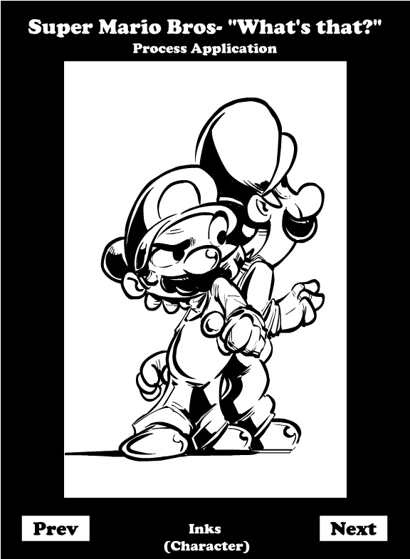
2. Character Inks- You've all heard that line from Chasing Amy- "FUCKIN' TRACER!" That's not true at all. Inkers are responsible for bringing out the most of a penciller's work. Google all the different inking styles of particular drawings (not incredibly vague, I know), and you'll see what I mean. For me, when I'm inking my own stuff, inking's not just a chance to clean up the line, but also do a little course-correction. (see Luigi go from determined to frightened, if you scroll between the inks and colors) Its also a chance to add details (like wrinkles and lighting), since I already nailed the core of the drawing in the pencil sketch.
3. Shadows- First and foremost, I want to get this out of the way- It's incredibly HYPOCRITICAL of me- but unless you're working in grayscale, you should not be using grays, blacks or whites past your inks. Those colors suck and draw attention away from all your other colors, so don't do it. I'm being FUCKING LAZY! That said, the other reason for shadows is to establish where your light is coming from. Establish your shadows, and you know where your lights are coming from. Establish your lights first and your shadows could still be hitting from anywhere. Especially combined with the effect of rimlights.
4. Flat colors- This is why not anyone can be a colorist, and why I don't consider mysef one. Color is established by many things, not just what color something happens to be. Sometimes its the sunlight (morning vs afternoon vs night vs streetlight, for example), sometimes its the color of the environment (ice caps vs volcano vs dessert, for example), sometimes its other factors (you ever notice how fog dissipates color and turns everything gray?) Those are all factors I should have taken into consideration with coloring Mario and Luigi rather than just slapping colors on them. And a real obsessive will probably note that those aren't their actual colors. See, in this day and age, when people pick colors, they assign actual hexadecimal numbers for the colors they use. My Crimson Fly character uses a very specific shade of Crimson. Likewise, Mario and Luigi's overalls use very specific shades of blue that only really differentiated in the gamecube era. I didn't check for a few reasons: I don't know if Nintendo does have a specific library for their character's colors, even if they did, it's probably not public info, I didn't really care, and most importantly, WILL YOU REALLY CARE EVEN IF YOU DID NOTICE?
5. Highlights- Remember that second half of the shadows paragraph? Yeah. Now that I know where my shadows are, I can establish where light is hitting the strongest. I can also use highlights to beef up the rimlights that got de-buffed when flat colors were added. Also, going back to my Hypocricy (as noted in shadows, again) I used white. Don't do that. Use an environmental color (yellow for the sun, or blue for the sky/water) but don't use white. It's just tacky.
6. mood shade- Using a mood shade helps unify a piece. It says, "all these elements belong in the same environment" or gives the illusion that all those colors (even the red and the black) are really "just some shade of blue" I got nothing else. It just makes things look nice!
7. inks (background)- So, Mario and Luigi can't be standing in a void. Well, they can, but a background looks nicer! Why is it so sparce? Well, I have a problem (if you look at some of my earlier work) of making things TOO detailed and drawing attention from where I want you to look. So I dial it back to a few vague shapes you'll recognize, in order to emphasize Mario and Luigi. Maybe in the future, I'll get better at it. But until then, enjoy your lines!
8. lighting (background)- Did you notice how Mario and Luigi popped when I lowered the opacity on the background inks? Yeah. That's why you don't use black. It EATS your attention.
9. Flat color (background)- again, I'm trying to minimize attention on the background, so minimal colors. I mean, the same rules apply as in the flat colors for the characters, but you have to be even more careful; there needs to be color, but not so much that it drowns out your focal points. You can see why I'm not a colorist
10. mood shade (narrative): Color can affect how you're supposed to feel; notice how, in tense situations in film, video games, and comics, things have a tendency to go "red?" You're supposed to feel tense and stressed out in those situations and the colors reflect that. Converse the blue and earthy greens at the beginning of the movie/video game/comic. Relax, you're here to have fun! Unfortunately, I wanted stress you out subconsciously, and make you wondere what Mario and Luigi were about to face down, so I threw in an orange mood shade to say "whatever they're about to look at, it's probably not good!"
11. My signature: Its less a vanity thing, and more an ID thing. I'm noticing that as I screw up less on the internet, people take more notice of my work. While I've been told I have a very definitive style, I want people to know "Collin Byrd drew this" rather than "I know there's a specific artist with that style, and it's probably him." And yes, there is a distinctive difference. The former may lead to a job or commission. The latter leads to more popularity, which may lead to the former. Why risk my chances?
12. Depth of field: A little trick (convert whatever you want to blur into a "movie clip", then use a blur filter) to make the background a little blurry. Like in real life! Also, to put more emphasis on Mario and Luigi. Sadly, Flash won't let me export this trick as an image file, which is why it's not in the finished version. So you get to see it here!
And that's my process. Hope you enjoyed or learned something about this. And who knows, if people like these, I'll keep making more!
Which lead to this:
And then I thought about something
asked, if I'd make more process apps like this:And I figured, why not?
After all, the key to these apps is to put each new step on both a new layer and a new keyframe in the flash timeline, use actionscript to tell the resulting movie to not play, and then use more actionscript to add button navigation. Pretty nifty, huh? huh? Or not. Sadly, one thing I didn't get to do with the last one, was describe my process (my lunch break wasn't long enough) I'm hoping to rectify that with this one. I hope you don't mind massive lines of text!
1. Pencil Sketch- the initial doodle I did in photoshop. If you've been around myu gallery, you'll notice that I like to refer to most of my illustrations as "doodles" This is because even "drawing" is too formal for me, and I like to "stream-of-conscious"/shotgun my drawings, observe fixes and/or better options, and then incorporate those fixes in later drawings. Formalizing my drawings takes a lot of the fun out of it, and makes me overthink everything, so I prefer to refer to my own doodles, as, well, doodles. Also, if it seems rough in the app vs. the actual drawing, this is because the initial drawing was done in photoshop, which is a raster program. Everything else was done in Flash, which is a vector program. This app exported at a higher resolution than the initial drawing, hence the roughness.
2. Character Inks- You've all heard that line from Chasing Amy- "FUCKIN' TRACER!" That's not true at all. Inkers are responsible for bringing out the most of a penciller's work. Google all the different inking styles of particular drawings (not incredibly vague, I know), and you'll see what I mean. For me, when I'm inking my own stuff, inking's not just a chance to clean up the line, but also do a little course-correction. (see Luigi go from determined to frightened, if you scroll between the inks and colors) Its also a chance to add details (like wrinkles and lighting), since I already nailed the core of the drawing in the pencil sketch.
3. Shadows- First and foremost, I want to get this out of the way- It's incredibly HYPOCRITICAL of me- but unless you're working in grayscale, you should not be using grays, blacks or whites past your inks. Those colors suck and draw attention away from all your other colors, so don't do it. I'm being FUCKING LAZY! That said, the other reason for shadows is to establish where your light is coming from. Establish your shadows, and you know where your lights are coming from. Establish your lights first and your shadows could still be hitting from anywhere. Especially combined with the effect of rimlights.
4. Flat colors- This is why not anyone can be a colorist, and why I don't consider mysef one. Color is established by many things, not just what color something happens to be. Sometimes its the sunlight (morning vs afternoon vs night vs streetlight, for example), sometimes its the color of the environment (ice caps vs volcano vs dessert, for example), sometimes its other factors (you ever notice how fog dissipates color and turns everything gray?) Those are all factors I should have taken into consideration with coloring Mario and Luigi rather than just slapping colors on them. And a real obsessive will probably note that those aren't their actual colors. See, in this day and age, when people pick colors, they assign actual hexadecimal numbers for the colors they use. My Crimson Fly character uses a very specific shade of Crimson. Likewise, Mario and Luigi's overalls use very specific shades of blue that only really differentiated in the gamecube era. I didn't check for a few reasons: I don't know if Nintendo does have a specific library for their character's colors, even if they did, it's probably not public info, I didn't really care, and most importantly, WILL YOU REALLY CARE EVEN IF YOU DID NOTICE?
5. Highlights- Remember that second half of the shadows paragraph? Yeah. Now that I know where my shadows are, I can establish where light is hitting the strongest. I can also use highlights to beef up the rimlights that got de-buffed when flat colors were added. Also, going back to my Hypocricy (as noted in shadows, again) I used white. Don't do that. Use an environmental color (yellow for the sun, or blue for the sky/water) but don't use white. It's just tacky.
6. mood shade- Using a mood shade helps unify a piece. It says, "all these elements belong in the same environment" or gives the illusion that all those colors (even the red and the black) are really "just some shade of blue" I got nothing else. It just makes things look nice!
7. inks (background)- So, Mario and Luigi can't be standing in a void. Well, they can, but a background looks nicer! Why is it so sparce? Well, I have a problem (if you look at some of my earlier work) of making things TOO detailed and drawing attention from where I want you to look. So I dial it back to a few vague shapes you'll recognize, in order to emphasize Mario and Luigi. Maybe in the future, I'll get better at it. But until then, enjoy your lines!
8. lighting (background)- Did you notice how Mario and Luigi popped when I lowered the opacity on the background inks? Yeah. That's why you don't use black. It EATS your attention.
9. Flat color (background)- again, I'm trying to minimize attention on the background, so minimal colors. I mean, the same rules apply as in the flat colors for the characters, but you have to be even more careful; there needs to be color, but not so much that it drowns out your focal points. You can see why I'm not a colorist
10. mood shade (narrative): Color can affect how you're supposed to feel; notice how, in tense situations in film, video games, and comics, things have a tendency to go "red?" You're supposed to feel tense and stressed out in those situations and the colors reflect that. Converse the blue and earthy greens at the beginning of the movie/video game/comic. Relax, you're here to have fun! Unfortunately, I wanted stress you out subconsciously, and make you wondere what Mario and Luigi were about to face down, so I threw in an orange mood shade to say "whatever they're about to look at, it's probably not good!"
11. My signature: Its less a vanity thing, and more an ID thing. I'm noticing that as I screw up less on the internet, people take more notice of my work. While I've been told I have a very definitive style, I want people to know "Collin Byrd drew this" rather than "I know there's a specific artist with that style, and it's probably him." And yes, there is a distinctive difference. The former may lead to a job or commission. The latter leads to more popularity, which may lead to the former. Why risk my chances?
12. Depth of field: A little trick (convert whatever you want to blur into a "movie clip", then use a blur filter) to make the background a little blurry. Like in real life! Also, to put more emphasis on Mario and Luigi. Sadly, Flash won't let me export this trick as an image file, which is why it's not in the finished version. So you get to see it here!
And that's my process. Hope you enjoyed or learned something about this. And who knows, if people like these, I'll keep making more!
Image size
576x784px 192.13 KB
© 2014 - 2024 SkipperWing
Comments1
Join the community to add your comment. Already a deviant? Log In
A wealth of information! Thanks so much for posting this. I know I will refer back to this more than once!